Short answer. The best author website examples share one habit: the newest book or the way into the books comes first. We opened ten live author sites on 13 October 2026, from fantasy to self-help, and measured each on a phone. Each one below gets what the home page leads with and one idea a first-time author can copy.
Key points
- Every site here puts a book, a series or a sign-up near the top.
- On a 390 px phone screen, only 4 of the 10 showed a buy, sign-up or download link before any scrolling.
- Big backlists need a "where to start" path. Sanderson and Riordan both have one.
- The nonfiction site here trades a free chapter for an email.
- Six of the ten show WordPress in their page source, the system we build our author websites in.
- You can copy the idea without copying the budget.
How did we pick these author website examples?
We chose ten bestselling authors, from fantasy to self-help, and loaded each home page on 13 October 2026. We kept only sites that loaded and belonged to the author. One name we tried led to a musician with the same name, so it is out. Each site below comes with its first phone screen as we saw it that day. We say what the page and menu do, not what the site cost.
What do fantasy and middle grade sites do well?
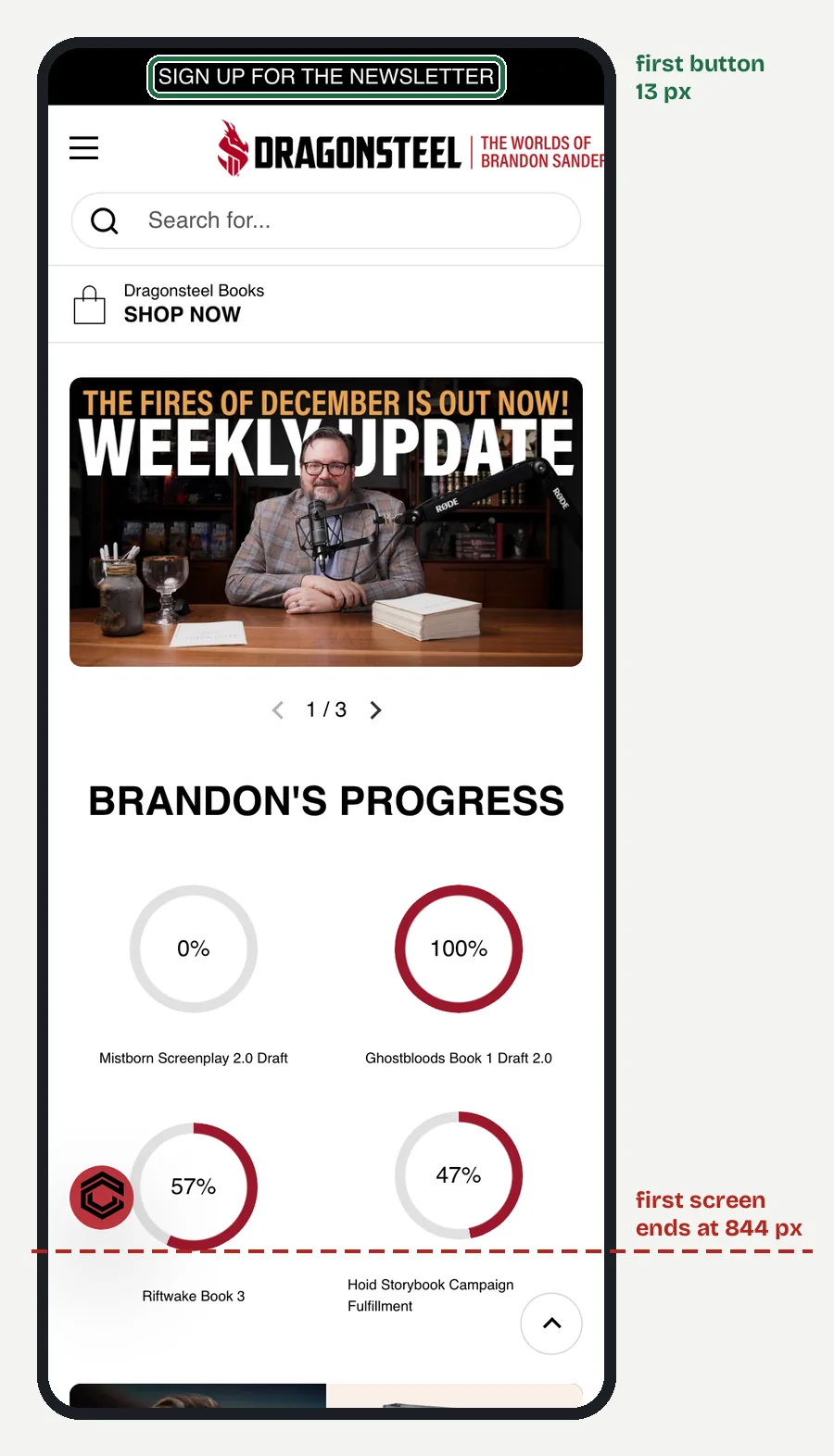
They give a big backlist a front door. Brandon Sanderson (brandonsanderson.com, fantasy) has "Start Here" at the top of the menu, with "Where Do I Start?" and "What is the Cosmere?" under it. A newsletter sign-up sits in the header bar.
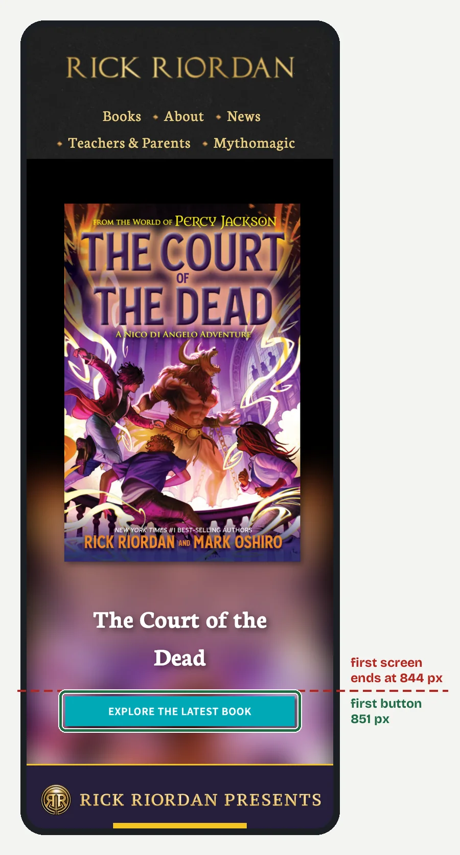
Rick Riordan (rickriordan.com, middle grade) lists every series by name in the Books menu, from Percy Jackson onward, and has a "Teachers & Parents" section. The home page opens on the latest book, The Court of the Dead, with "Explore the latest book."
The idea to copy: if you write a series, tell new readers which book is first.
What do thriller, horror and mystery sites lead with?
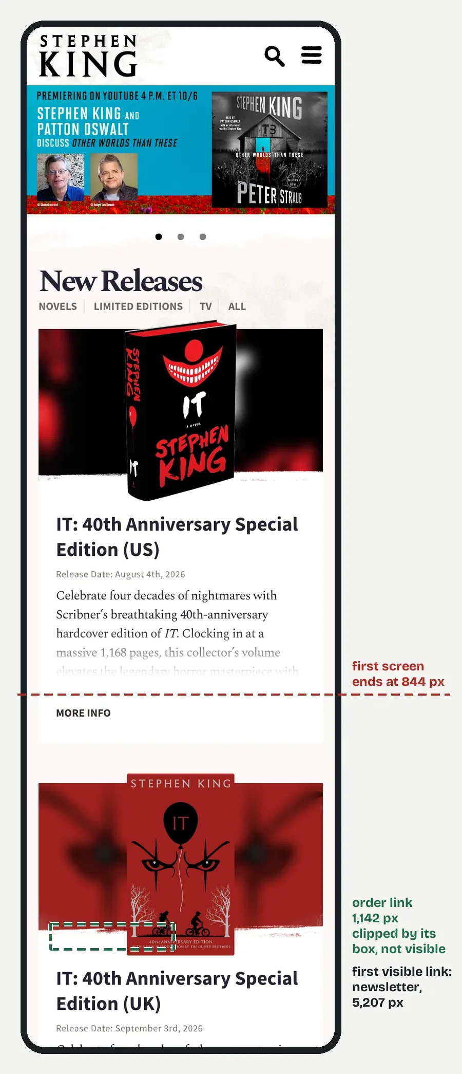
The new release. Stephen King (stephenking.com, horror) has a short menu: Works, Upcoming, The Author, News, FAQ, The Dark Tower. The home page opens on "New Releases" with a release date for each.
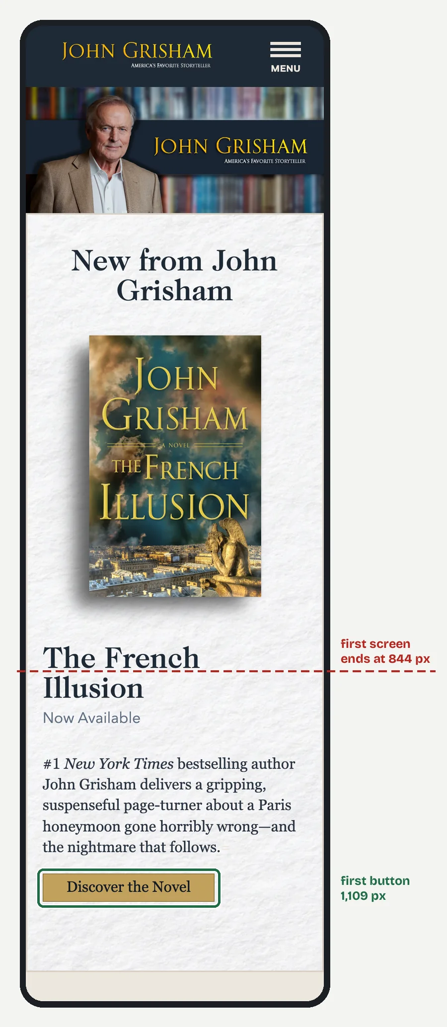
John Grisham (jgrisham.com, legal thriller) opens on "New from John Grisham" and The French Illusion. Below it sits a free short story prequel, The Law Student, with "Read the Story."
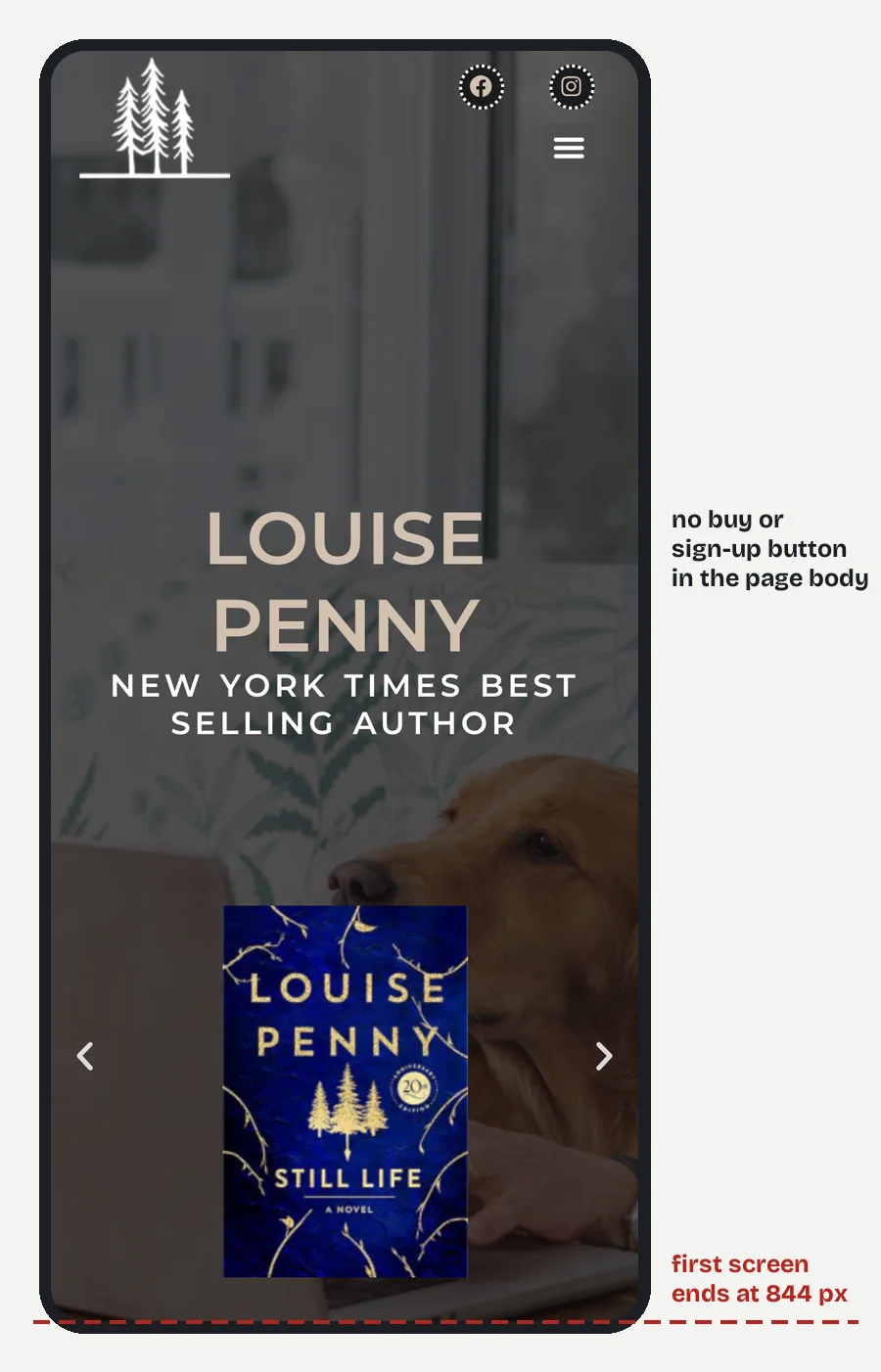
Louise Penny (louisepenny.com, mystery) lists every Gamache novel in the menu and gives the series' village its own sections, including "Café Three Pines."
The idea to copy: a free short story ahead of a new book, as Grisham does, gives a reader something to try today.
What do romance and historical fiction sites do well?
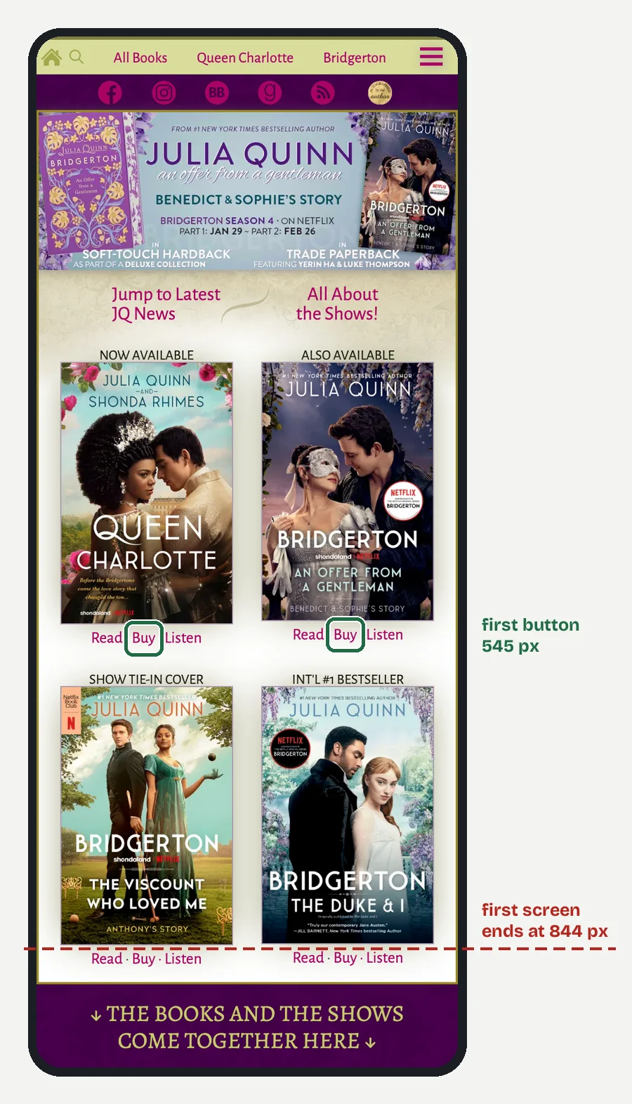
They make the series and the sign-up easy to find. Julia Quinn (juliaquinn.com, historical romance) has "Be the first to know about JQ's next book!" on the home page and "Binge this Series" further down.
Nora Roberts (noraroberts.com, romance) offers a release schedule and a printable full book list, and keeps her JD Robb books in the same menu.

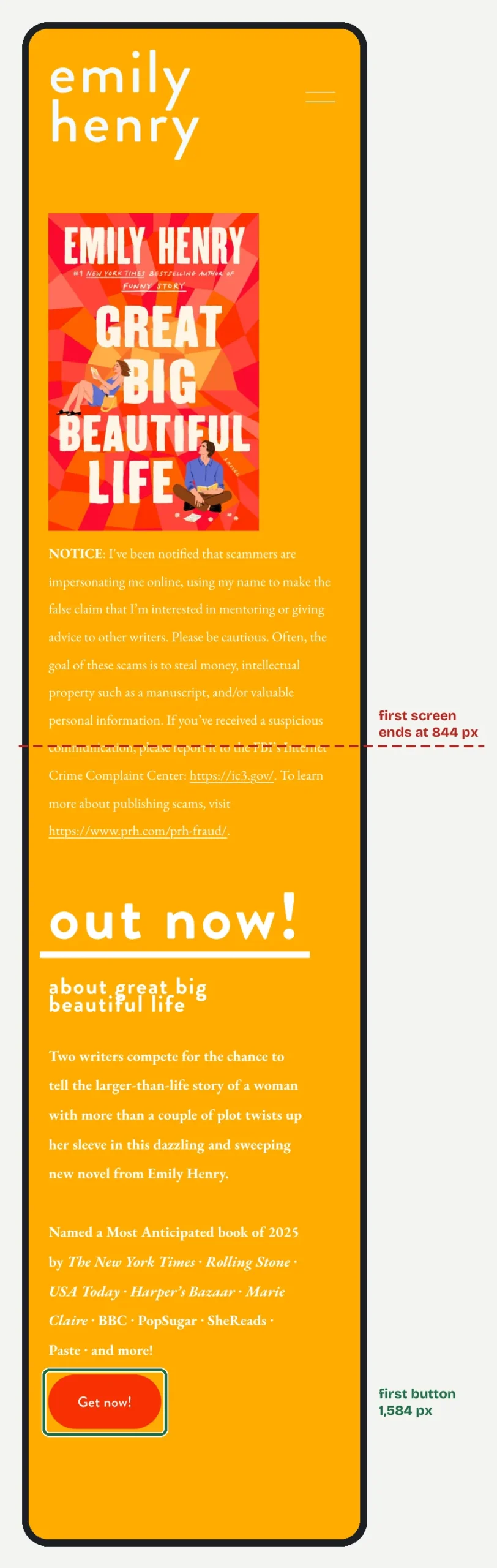
Emily Henry (emilyhenrybooks.com, contemporary romance) has one of the plainest menus here: bio, books, newsletter, bonus content, faqs, inquiries, store.
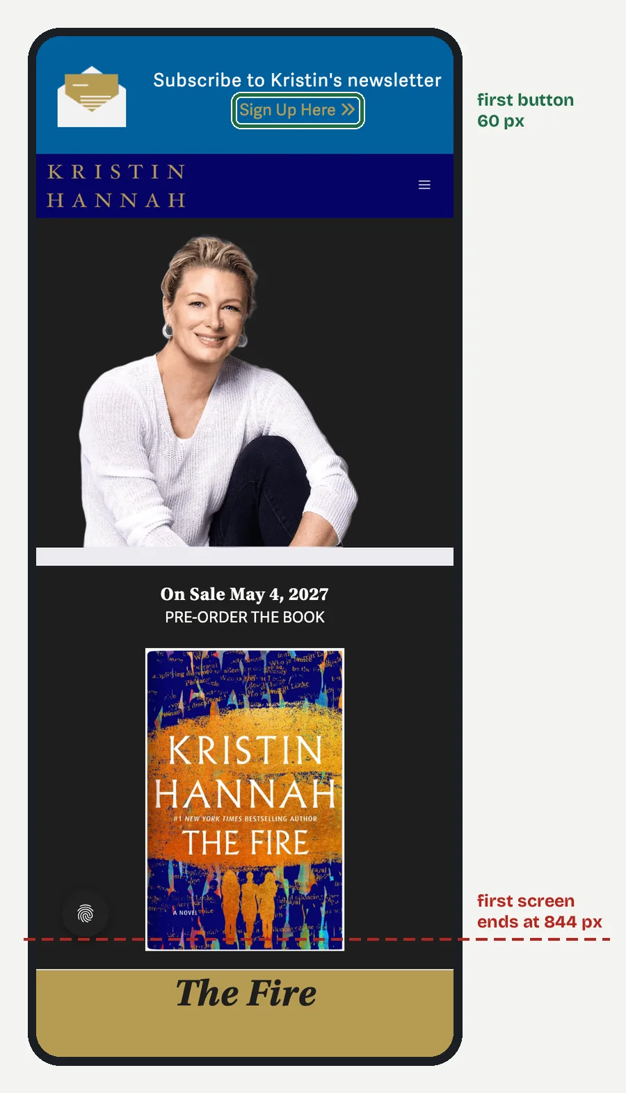
Kristin Hannah (kristinhannah.com, historical fiction) puts a newsletter link at the top and opens on a pre-order for The Fire, on sale 4 May 2027. "Book Clubs" has its own menu item.
The idea to copy: a printable book list, as Roberts has, is one page that saves readers a lot of searching.
What does a nonfiction author site do differently?
It offers something free for an email. James Clear (jamesclear.com, self-help) offers a download of chapter 1 of Atomic Habits near the top, and his menu is six words: Books, Articles, Newsletter, App, Speaking, About. The page source shows WordPress.
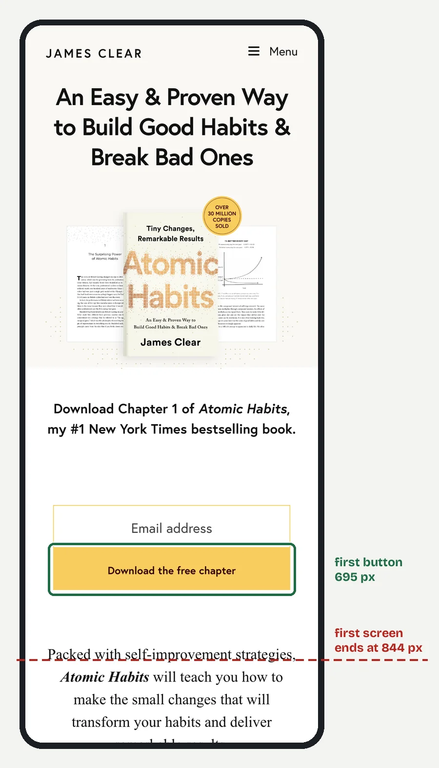
The idea to copy: one free chapter is the simplest sign-up offer an author can make.
Which of these ideas fit a one-page author site?
Most of them. A new author does not need ten menus. Put the newest book first with its buy link, write one line on which book to read first if you have more than one, add a short bio, and close with the sign-up form, ideally with a free chapter attached.
That is what our one-page site holds. Our post on which author website pages you need explains what to leave out.
How far down is the first button on a phone?
On five of the ten, below the first screen, and one had no such button at all. We loaded all ten home pages at 390 px wide and measured where the first link or button that asks the reader to act sat: buy, pre-order, sign up, download, or go to the newest book. Menus and cookie notices did not count. A 390 by 844 px phone shows 844 px before you scroll.
Four sat inside that first screen: Sanderson's newsletter bar at the top, Hannah's "Sign Up Here" at 60 px, Quinn's "Buy" at 545 px and Clear's "Download the free chapter" at 695 px.
Riordan's "Explore the latest book" sat at 851 px, 7 px below the first screen. King's "Order your copy here" link sat at 1,142 px, but its box cut it off, and the first link a reader could see was a newsletter link at 5,207 px. Emily Henry's "Get now!" sat at 1,584 px. Louise Penny's page ran 13,380 px long and had no buy or sign-up button in the body.
Readers who already know these names may scroll that far. A reader who has never heard of you has less reason to, so we check every author site at phone width before the author sees it.
What we build from this: send us your titles and a site from this list you like, and we build the same idea at your size in WordPress you own. Tell us about your books and we reply with a page plan and the price.
What else do authors ask about author website examples?
Your newest book with a buy link, or a sign-up offer.
Six of these ten do, going by their page source, including James Clear's, Kristin Hannah's and Rick Riordan's.
Copy the idea, not the size. A bestseller's menu is built for a long backlist.
Inside the first screen, so within about 844 px on a 390 px wide phone. Four of these ten sites managed it.
One line or one page that names book one, as Sanderson does.
Ours is $449 for one page and $849 for five; our post on what an author website costs has the detail.
What should you do next?
Pick one site from this list in your genre and write down the first thing it shows. Then make that the first thing on your site. When you are ready to build, start on our author website page.